Visual identity
The signatures, colours and typography of the Brazilian Society of Information Design
SBDI's current visual identity was proposed in September 2026 by the 2026–2028 Board. The proposal starts from an analysis of the signature used since 2020 and defines the signatures, colours, typography, supporting elements and guidance for use described on this page.
Signatures
The identity has three signatures: the full signature, the preferred signature and the signature for specific situations. The full signature has two versions: the main one, vertical, with the name below the square, and the secondary one, horizontal, with the name beside it. In the signatures with a square, “sbdi” sits at its bottom, centred across its width.
Full signature (main)
White square with “sbdi” in navy and, below it, the Society's name in two lines, centred and wider than the square, for coloured backgrounds.
Download as SVG
Horizontal full signature (secondary)
The same square, with the name beside it in two lines, for low and wide spaces such as this website's footer. The last line of the name sits on the same baseline as “sbdi”.
Download as SVG
Preferred signature
White square with “sbdi” in navy.
Download as SVG
Signature for specific situations
Only “sbdi”, in white.
Download as SVG
Versions for light backgrounds
The versions below invert the colours of the signatures, for use on white or light backgrounds. They were made for this website from the signatures in the proposal.

Main full signature, for light backgrounds
Download as SVG
Horizontal full signature, for light backgrounds
Download as SVG
Preferred, for light backgrounds
Download as SVG
Specific situations, for light backgrounds
Download as SVG
Colours
The colours below are for institutional communications, such as general assemblies and notices. For other activities, the proposal suggests widening the palette to suit each communication.
Navy
#312C62
RGB 49 44 98
Orange
#FF8D22
RGB 255 141 34
Light blue
#A6E6FF
RGB 166 230 255
Typography
Headings
Redonda Extrabold
Text
Raleway Regular
Redonda is a paid typeface. This website uses Red Hat Display ExtraBold, which is free, for headings. The name in the full signatures is in Red Hat Display Bold, converted to outlines, so it does not depend on the installed font.
Supporting elements
The supporting elements are geometric and modular and start from the square of the logo: the chequerboard of squares in the three colours, the cube in perspective and the stripes. The drawings that accompany the pages of this website are made with them.
How to use
- In institutional pieces, the logo is preferably placed at the corners of the layout.
- In text, whenever possible, the name is written in full: “Sociedade Brasileira de Design da Informação”.
The logo over time
The logos below are kept in SBDI's archive and in the old versions of this website, preserved in the Website archive.
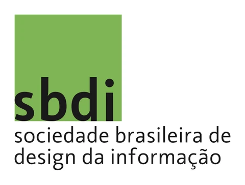
2007 to 2010
Priscila Farias (USP) designed a logo for SBDI between 2007 and 2010. The archive keeps the 2007 and 2008 studies and the 2009 and 2010 versions. In the 2010 version, “sbdi” sits at the bottom of a green square, with the Society's full name below.
2017 to 2020
From 2017 to 2020, SBDI's website showed “sbdi” in yellow, with the Society's name beside it. In April 2020, Julia Giannella (UFF) adapted this logo for social media and for the email newsletter.

2020 to 2026
From September 2020, SBDI used a dark grey square with “sbdi” in white at the centre and the Society's name below.
2026
In September 2026, the 2026–2028 Board proposed the current identity. The analysis of the 2020 signature aligns the letters, sets the hierarchy between “sbdi” and the full name, corrects the slant of the stem of the “d” and widens the spacing between the letters. “sbdi” moves down to the bottom of the square, as in the 2010 logo.